Check out 3 of the Best Landing Page Designs for 2012!
As we near the end of the year, we’ll look at some of the best landing page designs and go over what makes these designs great.
Apple’s iMac Landing Page
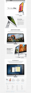
In the case of Apple, their landing page design in general is superb. The whole website has some of the best landing pages you’ll see, simply because of how clean and easy to use it they are. Apple’s website is great about avoiding distraction while still offering links to other parts of their website. The navigation and sub-navigations are subtle, which allows them to actively showcase the product you’re landing on without being distracted by visiting another part of the site.
As you scroll down, each aspect of the iMac is showcased with a clean, high quality stock photo and easy to read copy. Not only that, but the copy and photos are arranged in a way that’s relevant to the feature.
Finally, the page ends with consolidating on the content by offering you ways of buying their product. You can shop online, find a store, or call an Apple representative to place an order. This is a great example of pre-selling a product.

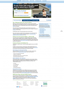
Geico’s Auto Insurance Quote page is a great example of one of the best landing page designs for 2012.
Geico Auto Insurance Quote
The Geico auto insurance quote page is a great example of lead acquisition landing page design. Right off the bat, they have an easy to use form above the fold with only 1 field, instead of asking for all of your information. This is ideal since most people will be turned off by “having to do work”. It’s much better to offer a simple way for the user to get a return on their interest than it is to make them put in more effort initially.
The best landing page design offers legibility and ease of use. This Geico page has a simple form, easy to read information below the form, and not too much distraction.
The Google Nexus
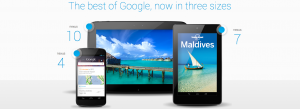
On first glance, this is going to look a lot like an Apple landing page design. That makes perfect sense, since that’s going to be their main competition for this product. However, what sets this landing page apart from the rest, is the fact that it’s showcasing 3 products instead of just one.
This landing page design is great because it’s so simple. You’re given 3 choices before much information is divulged. Also, the navigation is very clean and simple, with only a drop down menu to choose a device, a language option, and a shop button (call to action).
Once we choose the device we’re interested in, we’re immediately brought to a page that rivals the Apple iMac landing page design. You’re given easy to follow copy, call to actions to buy the product, and different ways of ordering. This is a great example of “building on an idea”, since they took the blueprint from Apple and created their own rendition by offering a menu of 3 different products on the initial landing page.


